The Power of CSS Grid Layout: The CSS Grid style has drastically changed the way we design and arrange web layouts. Its power is in its ability to generate sophisticated, responsive designs fast and effortlessly, giving it a level of control and flexibility that was previously unattainable. Let’s look at CSS Grid layout’s fundamental elements to properly understand its possibilities.
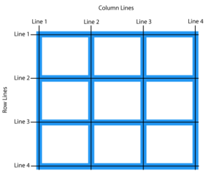
It is possible to precisely place and align components between rows and columns using the two-dimensional grid system that forms the basis of the CSS Grid layout. It is possible to specify the grid container and the components that go with it, which frees up developers’ code to create intricate layouts.
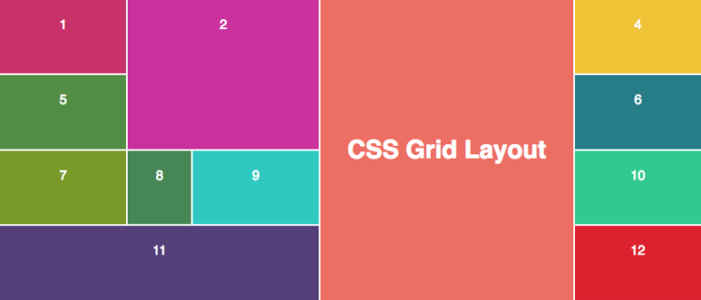
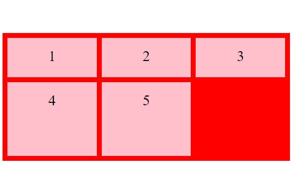
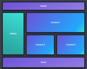
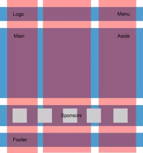
The two main components of the CSS Grid layout are the grid items and the grid container. The container is defined with {display: grid}, and the grid components are its immediate children. Making this adjustment facilitates the arrangement of the components in the layout.
CSS Grid Layout excels at creating responsive designs. Development teams may easily develop layouts that adapt to various screen sizes by utilizing features such as media queries, flexible lengths, and fr units. This improves the overall user experience across various devices.
You have a great deal of control over alignment and space using a grid layout. You may easily achieve the necessary layout aesthetics using CSS Grid, including centering items, dividing space evenly, and creating intricate alignments. There is a whole set of characteristics accessible.
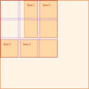
By delineating the horizontal and vertical divisions of the pattern, grid lines facilitate precise item placement. Tracks are the spaces between these lines that you may fill with items. Either resize them manually or let the tracks to adjust automatically in accordance with the material.
Because you can build named grid sections, layered grids, and overlap items using CSS Grid layout, you can construct extremely complicated designs with it. Developers may fulfil their creative goals thanks to this flexibility, which releases them from the limitations of traditional layout methods.
It’s important to consider browser compatibility and provide fallbacks for out-of-date browsers, just like with any new technology. Using feature queries and providing alternate layout options ensures a seamless transition for users of earlier browser versions.
To sum up, CSS Grid layout represents a significant breakthrough in web design by providing a robust and intuitive way to create complex layouts. Developers may break free from layout constraints and produce more robust and adaptable designs by embracing its possibilities. This can also help them streamline their workflow and unleash their creative potential.
Understanding CSS Grid layout’s potential entails more than just being adept with a new tool; it also entails taking a creative approach to web layout design, which empowers developers to produce exceptional user experiences across a variety of digital platforms.